User Experience for Beginners: Fix 7 Mistakes That Kill Blogs

📘 TL;DR – What you’ll learn: Your content might be excellent, but bad user experience drives visitors away. This guide reveals 7 deadly UX mistakes that kill blogs – slow speed, poor mobile design, tiny fonts, confusing navigation, cluttered layouts, no internal links, and accessibility issues. Fix these with simple, free tools and watch your bounce rate drop and time on site increase.
🔥 The Frustration of High Bounce Rates
You spend hours writing. You research keywords. You add images. You hit publish. Then you check your analytics. Bounce rate: 85%. Time on site: 17 seconds. People are leaving faster than they arrive, brother.
It hurts. You wonder if your content is bad. But here is the truth nobody tells you: your content might be excellent. Your user experience is the problem.
Visitors are impatient. If your blog is slow, confusing, hard to read, or frustrating to navigate, they leave – and they never come back. In 2026, good UX is not optional. It is survival.
This guide will show you 7 deadly UX mistakes that kill blogs – and exactly how to fix each one. No design degree needed. Just honest fixes you can apply today.
Before you fix UX, make sure your blog’s design is clean and professional. My Best Free Blogger Templates guide recommends fast, responsive themes. And to create images that load quickly without sacrificing quality, use Canva (free) – compress them with TinyPNG before uploading.
📌 Real story – Huda lost 60% of her visitors because of one stupid mistake
Huda had a food blog. Her recipes were amazing. But her bounce rate was over 80%. She could not understand why. Then a friend looked at her site on mobile. The font was tiny. The buttons were unclickable. The images took 5 seconds to load. On desktop, everything looked fine. On mobile – a disaster. She switched to a mobile‑friendly theme, compressed her images, and increased font size. Within two weeks, her bounce rate dropped to 45%. Time on site doubled. She did not write new recipes. She just fixed her user experience.
⚠️ The #1 myth about user experience: “UX is only for designers and big brands.” False. Every blog has a user experience – good or bad. Yours is either keeping visitors or driving them away. You choose.
✅ What Is User Experience? (Simple Definition)
User experience (UX) is how a person feels when they use your website. Is it easy? Fast? Pleasant? Or is it confusing, slow, and frustrating?
Good UX means visitors find what they need quickly, enjoy reading your content, and want to come back. Bad UX means they leave angry and never return.
Google also cares about UX. Sites that load fast, work on mobile, and keep visitors engaged rank higher. Fixing UX helps both your readers and your SEO.
📋 The 7 Deadly UX Mistakes That Kill Blogs (And How to Fix Them)
Mistake #1 – Slow Loading Speed (Visitors Won’t Wait)
Pages that take more than 3 seconds to load lose over half of their visitors. Every extra second kills conversions.
How to fix it:
- Compress images using TinyPNG or Squoosh before uploading.
- Use a fast, lightweight theme (avoid bloated templates).
- Test your speed on PageSpeed Insights or GTmetrix. Follow their recommendations.
Mistake #2 – Not Mobile‑Friendly (Over 60% of Traffic is Mobile)
If your blog looks broken on a phone, mobile visitors will bounce instantly. Huda learned this the hard way.
How to fix it:
- Choose a responsive theme (most modern themes are).
- Test your blog on your own phone. Click links. Read text. Check buttons.
- Use Google’s Mobile‑Friendly Test tool to identify issues.
Mistake #3 – Tiny Fonts and Poor Readability
If readers have to zoom in to read your text, they will leave. If paragraphs are too long, they will skim – and miss your value.
How to fix it:
- Use a font size of at least 16px for body text.
- Keep paragraphs to 2‑4 sentences maximum. (Learn from Visual Content for Bloggers for design tips that improve readability.)
- Use headings (H2, H3) to break up content.
- Add white space between sections – do not cram everything together.
Mistake #4 – Confusing Navigation (Readers Get Lost)
If visitors cannot find your About page, categories, or search bar, they feel frustrated and leave.
How to fix it:
- Keep your main menu simple – 4 to 6 items (Home, About, Blog, Contact).
- Add a search bar (Blogger and WordPress both have search widgets).
- Organize posts into clear categories. Display category links in your sidebar or header. (For a complete guide on category structure, read Categories in Blogger.)
Mistake #5 – Cluttered Layout with Too Many Distractions
Popups, flashing ads, endless sidebars, and auto‑play videos annoy readers. They came for your content – not for noise.
How to fix it:
- Remove unnecessary widgets from your sidebar.
- Limit popups – show them only after a delay or on exit intent.
- Avoid auto‑play videos or music.
- Use white space to let your content breathe.
Mistake #6 – No Internal Links (Visitors Leave Immediately)
When someone finishes a post, where do they go? If you do not guide them, they leave your site. Internal links keep readers on your blog longer.
How to fix it:
- Add 3‑5 internal links per post, linking to related content.
- End each post with a “You might also like” section (many themes have this feature).
- Link to your cornerstone content from multiple posts.
Mistake #7 – Ignoring Accessibility (Excluding Some Readers)
Accessibility means designing for everyone – including people who use screen readers or have visual impairments.
How to fix it:
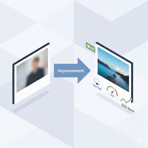
- Add alt text to every image (describes the image for screen readers).
- Use sufficient color contrast (dark text on light background).
- Make sure buttons and links are easy to click on mobile.
💡 Pro Tip: Once a month, watch a recording of a real visitor on your site using Microsoft Clarity (free). You will see exactly where they click, scroll, and get stuck. Fix what you see.
📋 Quick UX Checklist for Every Blogger (Print This)
- ☐ Page loads in under 3 seconds on mobile.
- ☐ Blog is responsive – looks good on phone, tablet, and desktop.
- ☐ Font size is at least 16px for body text.
- ☐ Paragraphs are short (2‑4 sentences).
- ☐ Navigation menu has 4‑6 clear items.
- ☐ Search bar is easy to find.
- ☐ No annoying popups or auto‑play videos.
- ☐ Internal links are added to every post.
- ☐ Images have alt text.
- ☐ Blog is clutter‑free (only essential widgets).
🛠️ Tools to Audit Your User Experience (Free)
- PageSpeed Insights – Test loading speed and get fixes.
- Google’s Mobile‑Friendly Test – See if your blog works on phones.
- Microsoft Clarity – Record real visitor sessions (free heatmaps and recordings).
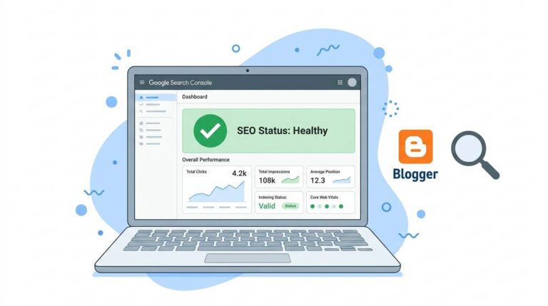
- Google Search Console – Identify pages with high bounce rates.
- Canva – Create clean visuals and infographics to improve engagement.
💡 The Brutal Truth (Read This Twice)
Most bloggers obsess over content, SEO, and traffic – while ignoring user experience. They wonder why people leave immediately. Huda lost 60% of her visitors because of a simple mobile issue. The fix took a weekend. Her bounce rate dropped from 80% to 45%.
User experience is not optional. A blog that loads slowly, looks broken on mobile, or has tiny fonts will fail – no matter how good the content. Fix these 7 mistakes, and you will keep readers longer, earn more trust, and rank higher on Google.
⚠️ Remember: Google ranks fast, mobile‑friendly, engaging sites higher. Improve UX and your SEO will also improve. It is a win‑win.
📅 Your 7‑Day UX Makeover Plan
- Day 1: Test your site speed. Compress all images. Remove slow plugins.
- Day 2: Test on mobile. Fix any broken layouts. Increase font size if needed.
- Day 3: Simplify your navigation. Remove unnecessary menu items. Add search bar.
- Day 4: Audit your sidebar and popups. Remove anything that annoys readers.
- Day 5: Add internal links to your 5 most popular posts.
- Day 6: Check alt text for all images. Add missing ones.
- Day 7: Install Microsoft Clarity. Watch 10 visitor recordings. Fix what you see.
After 7 days, your bounce rate will drop. Your readers will stay. And Google will notice.
🙋 Frequently Asked Questions
Do I need to hire a designer to improve UX?
No. Most fixes are simple: compress images, choose a responsive theme, simplify navigation, and write clearly.
How long until I see results from UX fixes?
Immediately. Faster loading and better navigation reduce bounce rate within days.
Is UX more important than SEO?
They work together. Google ranks fast, mobile‑friendly, engaging sites higher. Improve UX and your SEO will also improve.
What is the biggest UX mistake beginners make?
Ignoring mobile. Most traffic is mobile, but many bloggers only check their site on desktop.
🎤 Final Thoughts: Your Blog’s Success Depends on Experience, Not Just Content
You can write the best content in your niche. But if your user experience is bad, nobody will stick around to read it.
Huda lost 60% of her visitors because of a simple mobile issue. She fixed it. Her traffic grew. You can do the same.
Do not wait until your bounce rate destroys your blog. Take the checklist above. Fix one mistake today. Another tomorrow. Within a week, your blog will feel completely different – to both visitors and Google.
Your readers deserve a smooth, pleasant experience. Give it to them.
You have got this, brother. 🚀
👉 Ready to fix your blog’s user experience today? Test your site speed with PageSpeed Insights (free). Find what’s slowing you down. Fix it. Watch your bounce rate drop.